BIRTH OF A COVER
CREATIVE PROCESS
The possibility of drawing and creating creativity within a project that at first reading smelled on one side of history and on the other of children excited me very quickly..
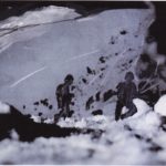
The mule, before being a story, was an exchange of images between me and Francesca linked to her rummaging through the family photographic archive: images and photographs from the last century, taken among clear mountain panoramas and lands where an atrocious war was also fought.
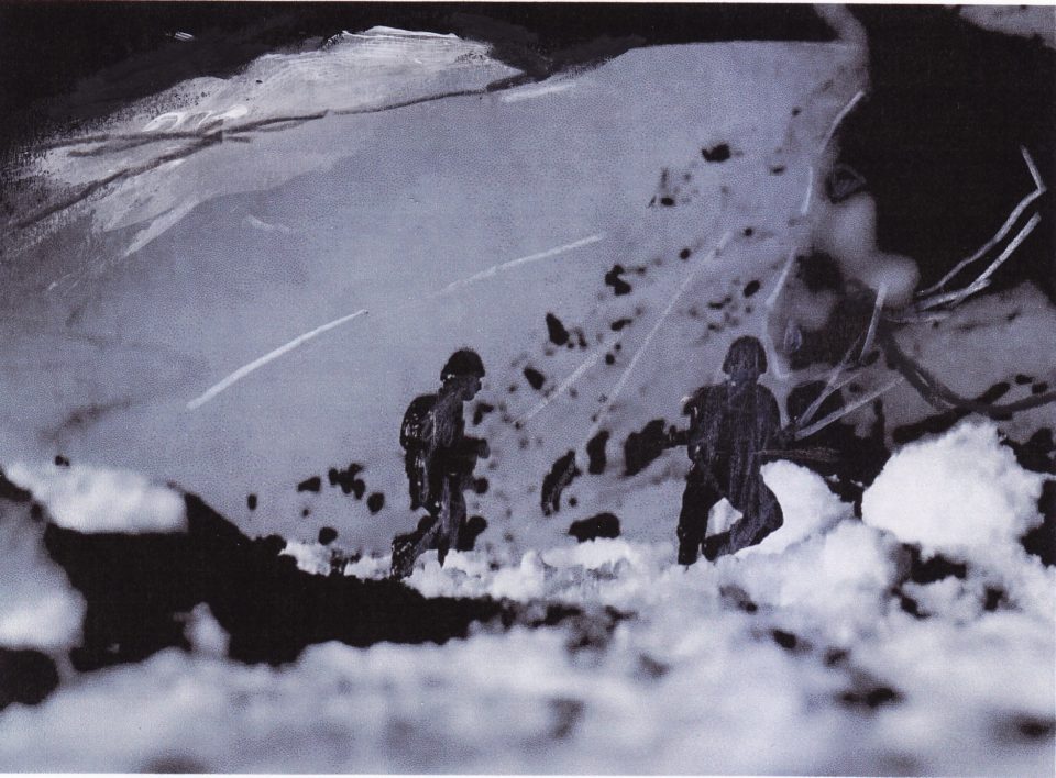
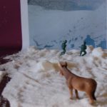
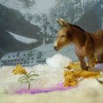
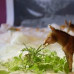
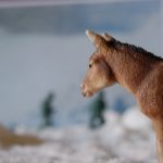
How to bring all this back into the childish and natural language of the donkey? At that point the toy soldiers came to mind, plastic animals, an imaginary game fortunately remains such and has allowed our generation to never experience the atrocity of war, if not with plastic soldiers hidden behind the chairs and desks at home.
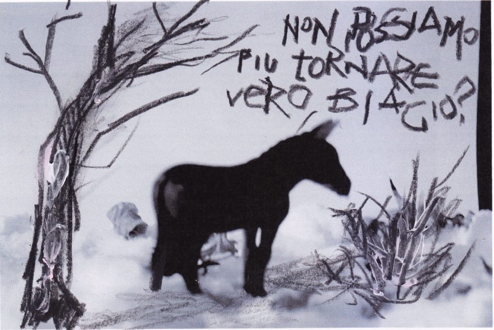
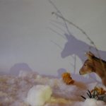
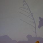
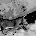
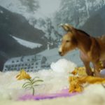
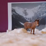
This is how the illustration project was born: I still remember when Francesca arrived at my house with her eyes wide open while I had spread a layer of coarse salt on the kitchen table, the prints of his photographs stuck to the wall and scattered in the salt, threads of rosemary taken from the terrace and plastic animals together with the toy soldiers from when I was little. The illustration project was born like this.
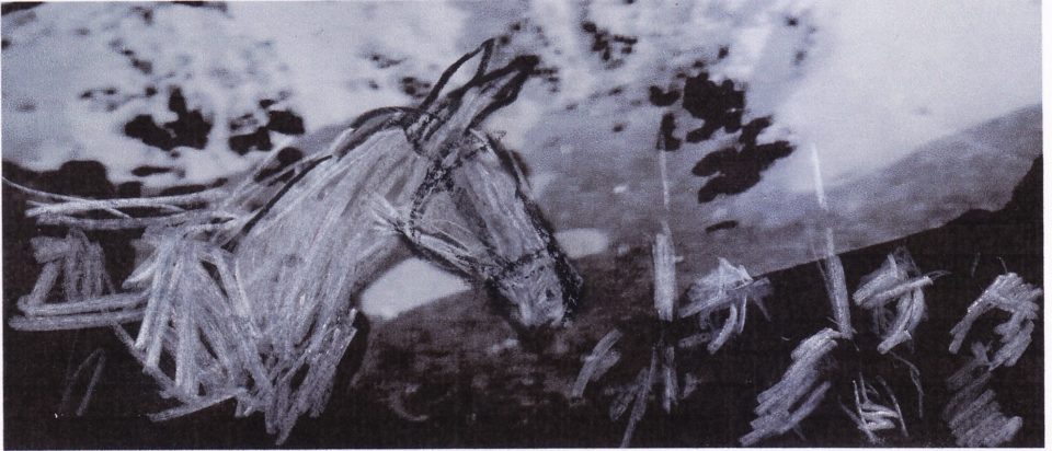
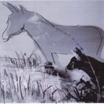
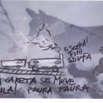
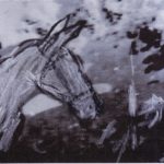
The great hyper-realist illustrator and painter Riccardo Mannelli, with whom I worked for many years on the satire magazine Cuore, always told me: a beautiful photograph is just a beautiful photograph, a mediocre or ugly photograph can become inspiration for a work of art. I took photographs that were sometimes deliberately blurry, Rough, overexposed. Turning into black and white, this scenario from children's games played by adults then became the territory and images of memory, that they earned, in chromatic compactness, an unexpected historical identity. At that point, working with my graphic sign and the corruption of the image on these prints was really a game.
A pure game I played, using both hands, getting my fingers dirty, trying to think with the mind of a donkey. For charity, in the end it wasn't even particularly difficult.
In the end the goal was to create illustrations that could be for children but also and above all readable by an adult eye, that would help that double-bottomed reading of Francesca's novel. Apparently childish reasoning and language, in depth a journey into insecurities, fears and memory, among family stories, games, imaginaries and fears.
It's a fairy tale. And like all fairy tales it runs the gamut of emotions. So I also wanted to illustrate a fairy tale, in a playful way, sometimes ironic, but also knowing that history is not to be trifled with. This is a teaching that in my opinion must also speak a lot to our present.
From model to photography
